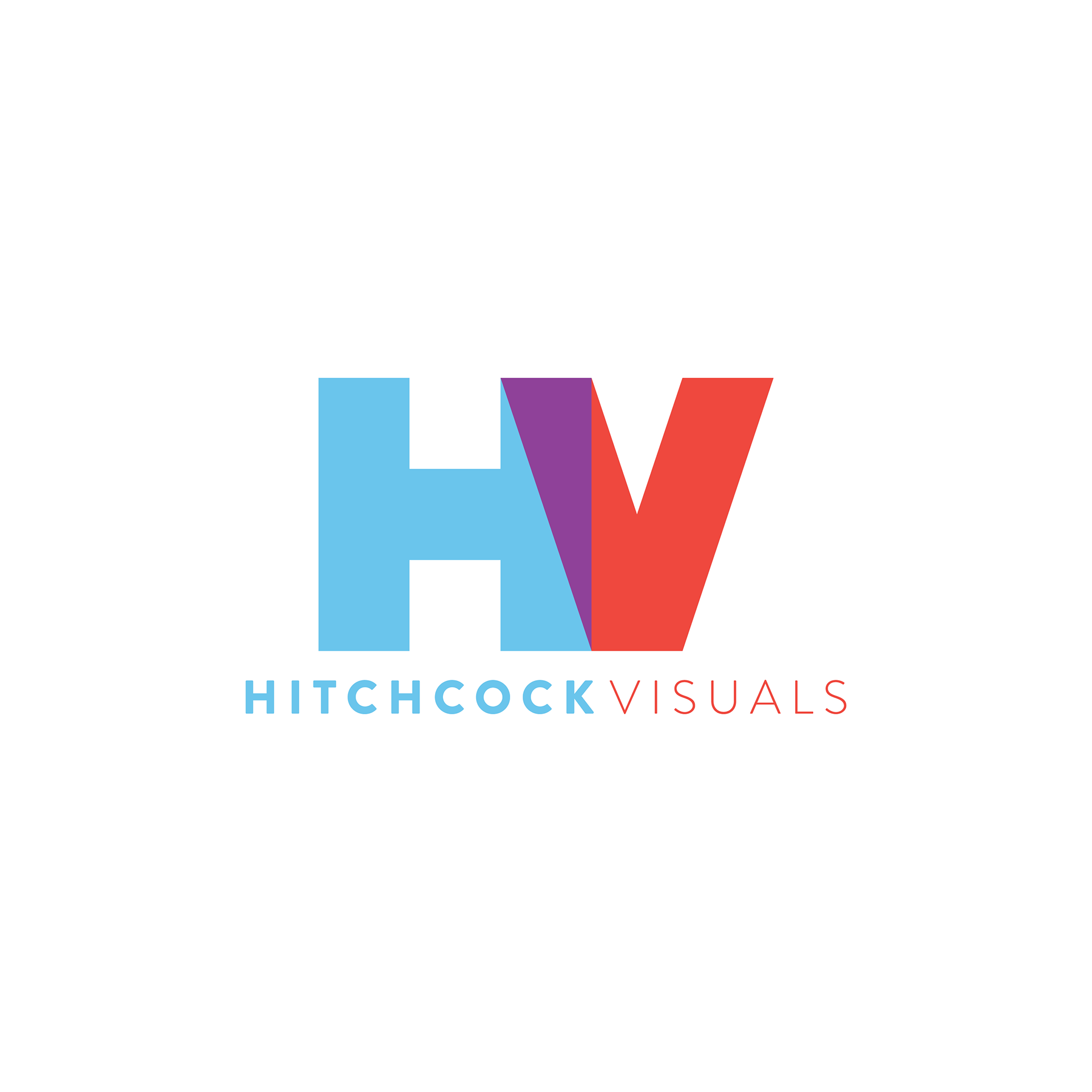
Hitchcock Visuals reached out to me for a rebrand.
There was a lot to consider for this project to really make them stand out in the crowd. Strategically, the logo needed to relate to video in some way, while being recognized as Hitchcock Visuals. Regarding execution, the logo needed to stand out, be bold, be simple and sophisticated, and be able to be used across all formats from business cards to watermarks to baseball caps.
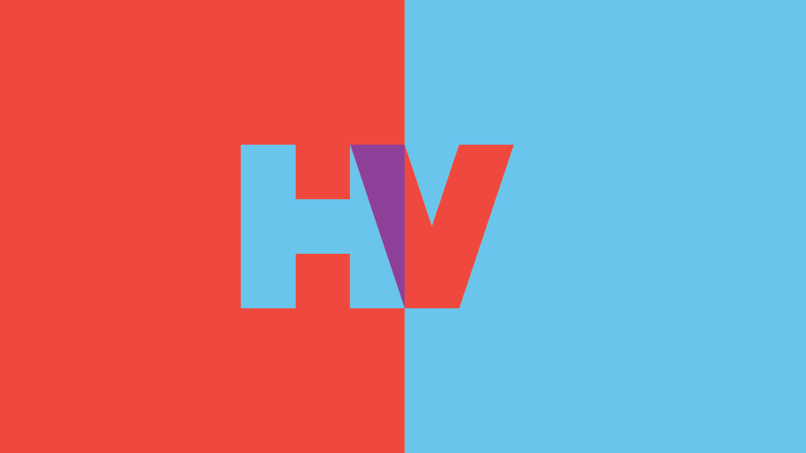
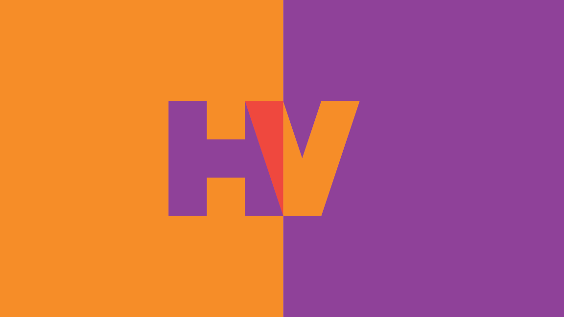
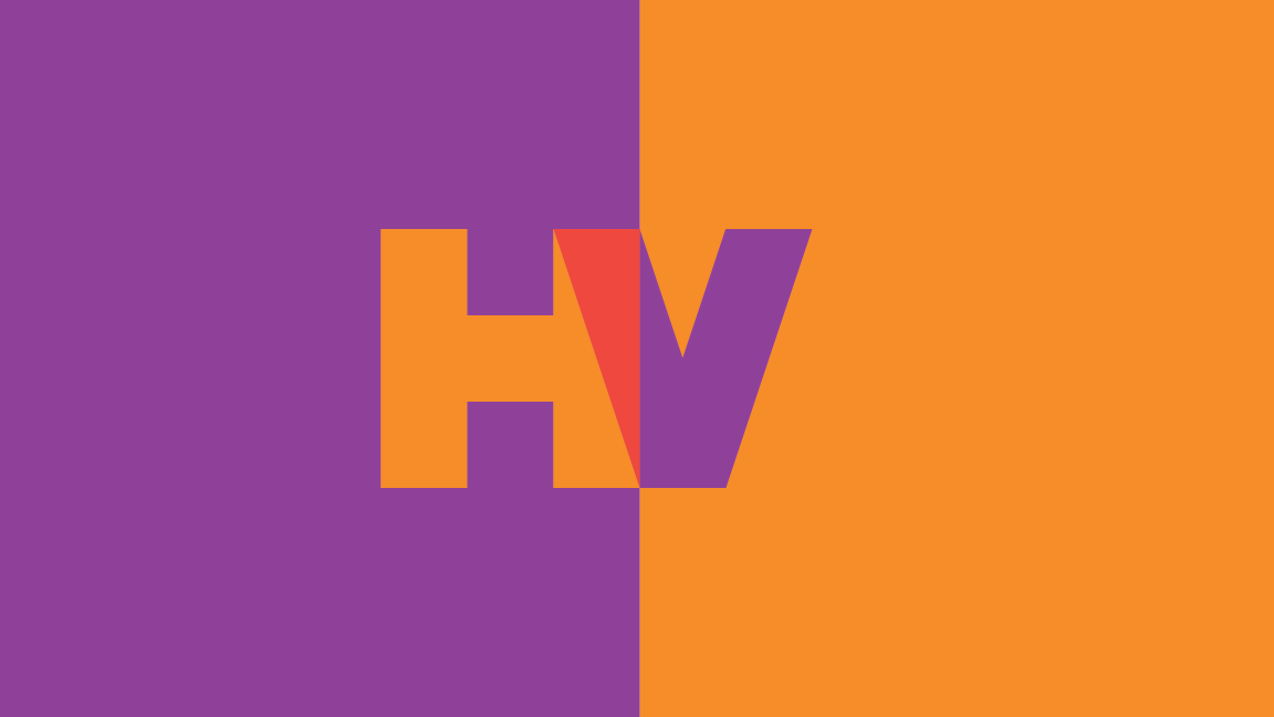
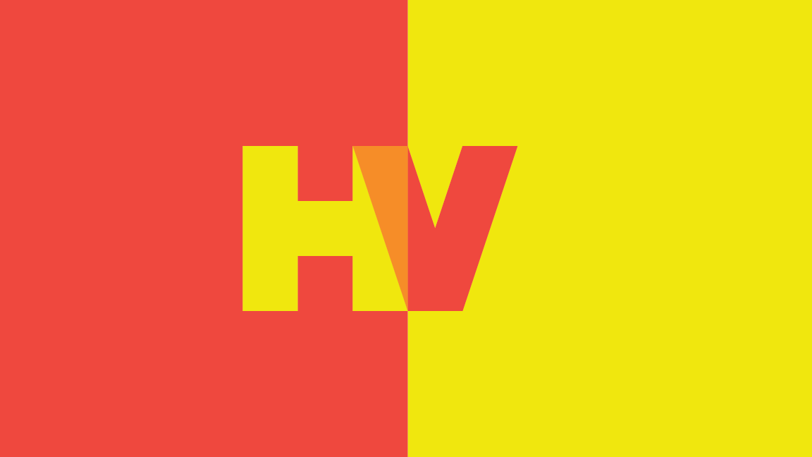
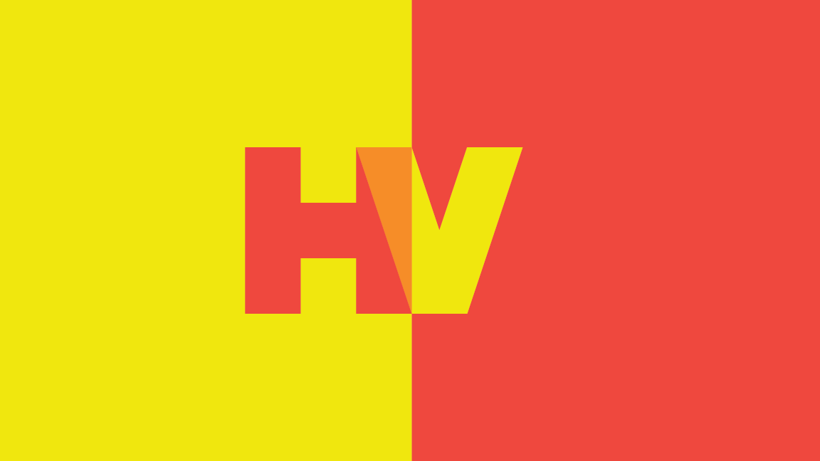
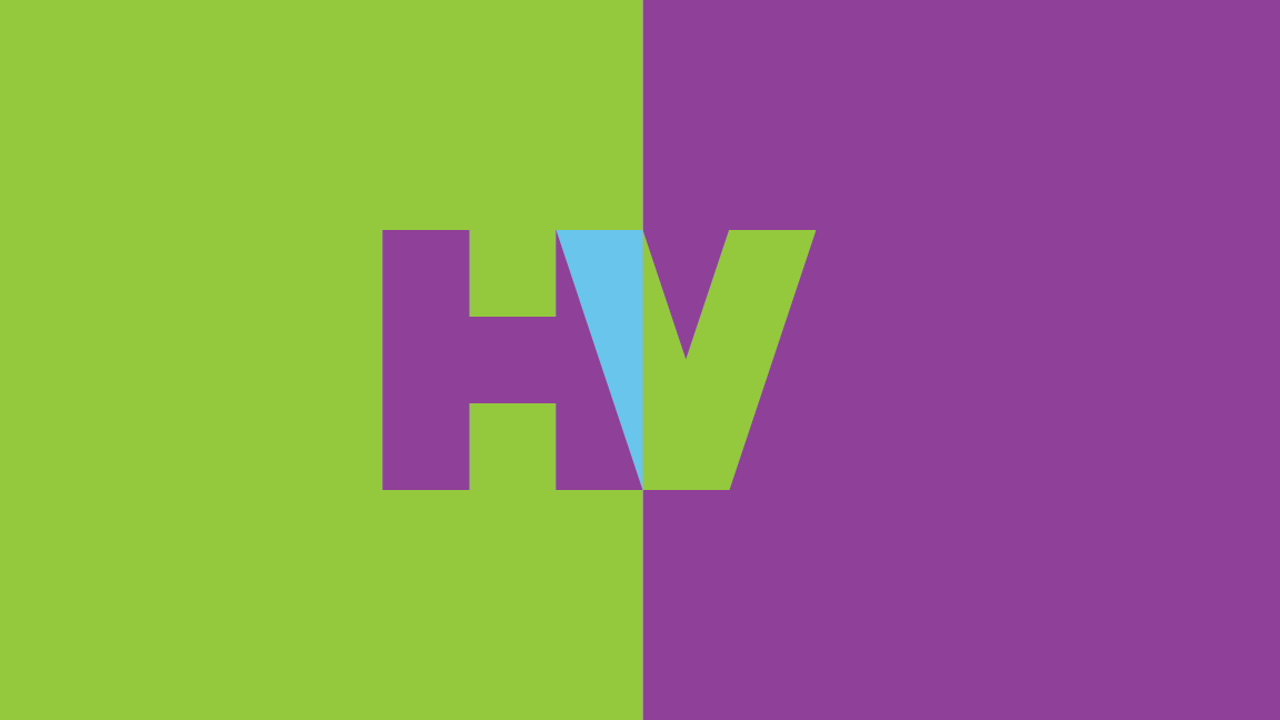
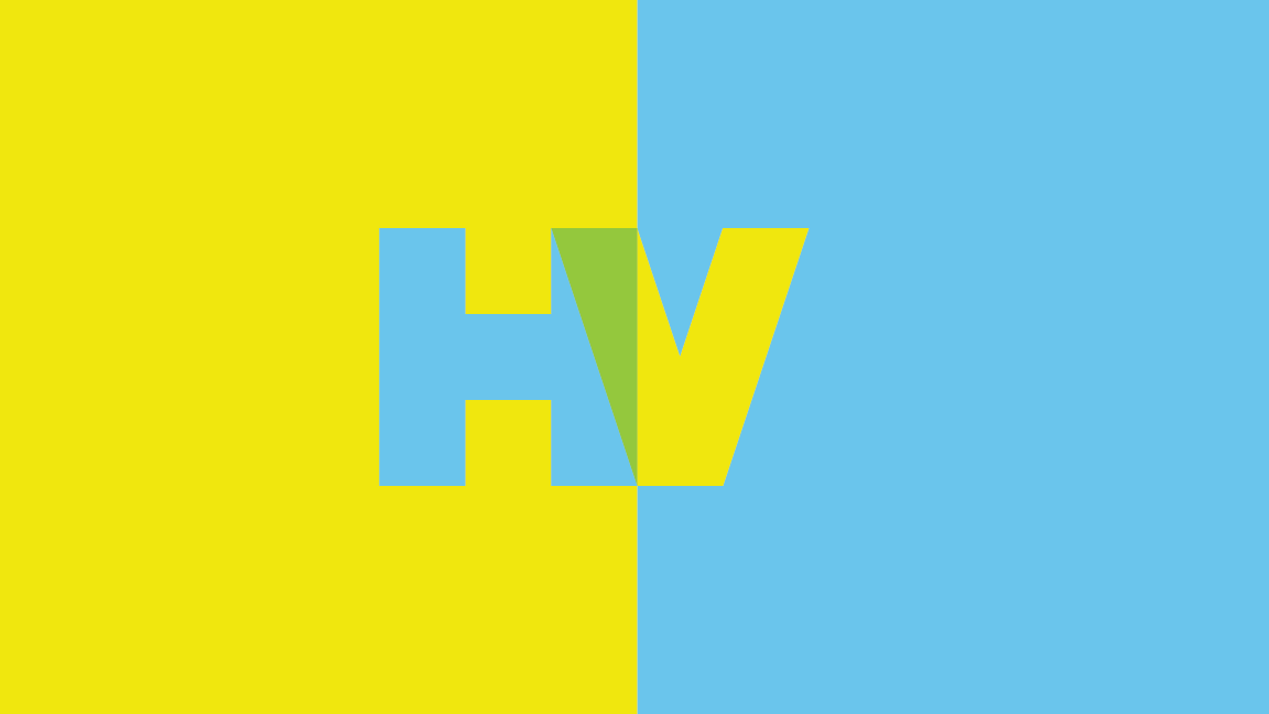
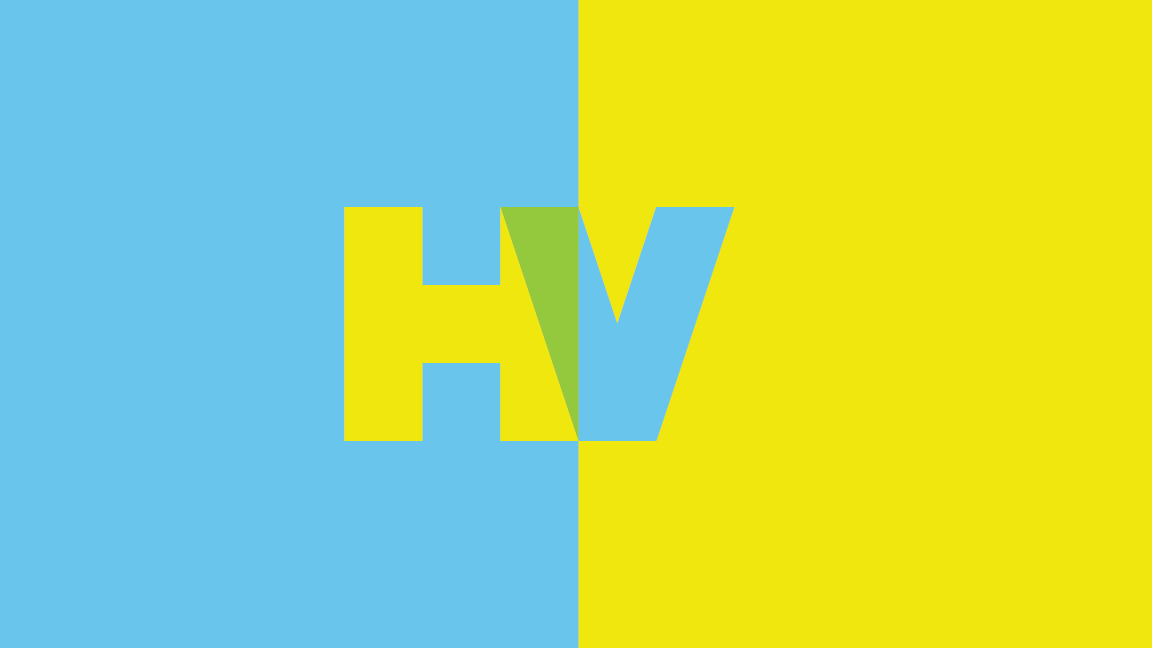
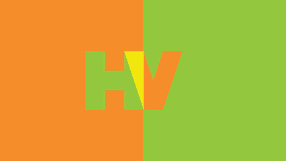
The concept that we came up with uses a customized HV mark that overlaps to create a film projection lighting up the sky, which can either represent a film being projected on a screen, or a light marking the sky at a premier. Also, to help them stand out, a wide range of color options were provided. These color schemes move around the color wheel, playing on primaries and the secondaries they form, as well as dabbling in complementary pairings.